
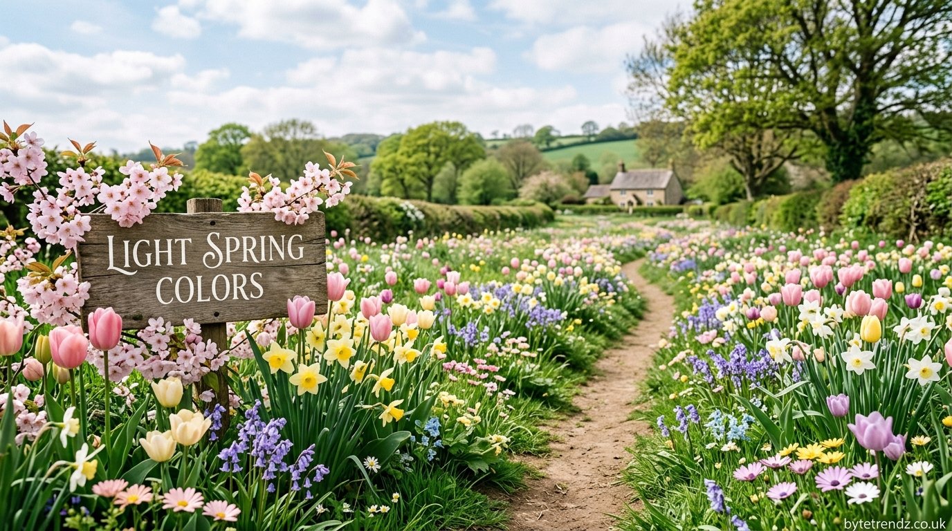

Light spring colors are soft, warm-toned hues — think blush pink, buttery yellow, sage green, and powder blue — that mimic the freshness of new growth after winter. Unlike cool pastels used in summer palettes, light spring shades carry a warm undertone, which is what makes them feel bright and alive rather than washed out. Light spring colors They work equally well in home decor, fashion, and design projects.
That’s the short answer. Below is the full breakdown: which shades qualify, how to pair them, where to use them, and the mistakes most people make when working with this palette.
Why Light Spring Colors Work
Every seasonal palette is built around undertone, not just lightness. This is the detail most color guides skip, and it’s the reason some “pastel” choices end up looking flat or grayish instead of fresh.
- Spring palettes lean warm. Yellow, peach, and gold sit underneath most spring shades, even the blues and greens.
- Winter and summer palettes lean cool. That’s why an icy lavender (summer) and a warm lilac (spring) can look similar in a swatch but completely different on a wall or in an outfit.
- Saturation stays low, but clarity stays high. Light spring colors aren’t dusty or muted — they’re clean and light-reflecting, which is what gives them that “just bloomed” quality.
Color psychology backs this up: warm, light hues are consistently associated with renewal, optimism, and calm energy — which is exactly why brands, decorators, and stylists reach for this palette every spring.
Top Light Spring Colors
Here are six reliable shade families, grouped with approximate hex codes so you can use them directly in design work, paint matching, or mood boards.
| Color Family | Example Shade | Hex Code | Best For |
|---|---|---|---|
| Blush Pink | Soft Petal | #F4C9C4 | Walls, blouses, packaging |
| Sage Green | Morning Sage | #B7C4A6 | Cabinetry, dresses, branding |
| Buttery Yellow | Warm Churn | #F5DEA0 | Accent walls, accessories, kids’ rooms |
| Powder Blue | Sky Wash | #C6DDEA | Bedding, shirts, stationery |
| Lavender | Warm Lilac | #DCC7E8 | Florals, nail polish, event décor |
| Cream | Soft Linen | #F7EFE1 | Base/neutral for any spring palette |
Use one of these as your dominant color, one as a secondary, and cream or a soft neutral as your base — that three-part structure is what keeps a spring palette from feeling scattered.
How to Pair Light Spring Colors
Pairing light shades incorrectly is the fastest way to make a palette look weak instead of intentional. These combinations are tested favorites across interior design and fashion styling:
- Sage green + cream + a touch of blush — calm, grounded, works in both a living room and a capsule wardrobe.
- Lavender + buttery yellow — higher contrast, good for florals, packaging, or a statement outfit.
- Powder blue + cream + warm gold accent — classic spring combination, especially in home textiles.
The rule that matters most: pair at least one light shade with one slightly deeper, warm-toned accent (terracotta, warm brown, or olive). Without that anchor, an all-pastel palette can look pale and undefined in photos or under natural light.
Where to Use Light Spring Colors
In your home Walls, throw pillows, kitchen accents, and entryway décor are the easiest starting points. A single accent wall in sage or blush lets you test the palette before committing to a full room.
In your wardrobe Light spring colors work best as your dominant pieces (dresses, blouses, outerwear), paired with a neutral like cream, tan, or soft white. Save darker tones for shoes or bags to avoid the palette washing out.
In design and branding For social graphics, packaging, or seasonal campaigns, light spring palettes signal freshness and approachability — commonly used by beauty, wellness, and lifestyle brands for spring launches.
Common Mistakes to Avoid
- Using cool pastels instead of warm ones. An icy blue or gray-lavender will clash with true spring tones — check the undertone before matching colors.
- Skipping the anchor color. An all-light palette with no contrast tends to disappear in photos and under indoor lighting.
- Ignoring lighting conditions. Light spring colors shift more than people expect under artificial light — always check a swatch or fabric sample in natural daylight before finalizing.
Frequently Asked Questions
What are light spring colors? Light spring colors are soft, warm-toned hues like blush pink, sage green, buttery yellow, and powder blue, associated with the spring season for their fresh, warm quality.
What’s the difference between spring colors and pastel colors? Not all pastels are spring colors. Spring shades have warm undertones, while pastels can lean warm or cool. A cool-toned pastel (icy blue, gray-lavender) belongs to a winter or summer palette, not spring.
What colors pair well with light spring colors? Cream, soft white, and warm neutrals pair well as a base. For contrast, add one deeper warm tone like terracotta or olive to anchor the palette.
Are light spring colors good for a whole room, or just accents? Both work, but for a first attempt, start with accents (pillows, one wall, accessories) before committing to a full room, since light colors shift significantly under different lighting.
Final Thoughts
Light spring colors work best when you treat them as a system, not a single shade — pick one dominant hue, one secondary, a neutral base, and one warm anchor. That structure is what separates a polished spring palette from one that looks accidental.
