


If you’ve been told you’re a “True Spring” — or you suspect you might be — this guide walks through exactly what that means, which colors belong in your palette, and how to use them in your wardrobe, makeup bag, and hair color choices. No guesswork, no fluff.
What Is a True Spring Color Palette?
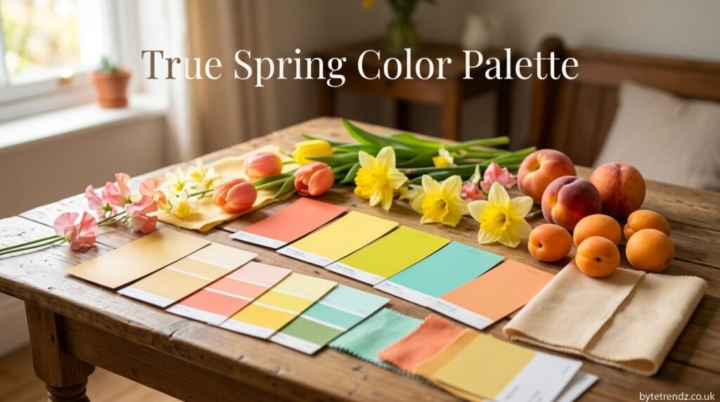
A True Spring color palette is a set of warm, clear, saturated colors matched to people with golden undertones, medium contrast between skin/hair/eyes, and a naturally bright, fresh coloring. It’s one of four Spring types in the 12-season color analysis system, sitting right in the middle between Bright Spring and Light Spring — which is why stylists sometimes call it “the original Spring.”
Three traits define the palette:
1. Warm undertone. Every color in a True Spring palette has a yellow or golden base. There’s no blue undertone anywhere in the mix — even blues in this palette get pulled toward turquoise or teal so they stay warm.
2. Bright, clear saturation. These colors are vivid, not dusty or muted. Think fresh paint rather than a color that’s been left in the sun too long.
3. Light-to-medium value. True Spring avoids the deep, near-black shades you’d see in a Winter or Dark Autumn palette. Even the darkest neutrals stay on the lighter side of medium.
True Spring vs. the Other Spring Types (Quick Comparison)
| Type | Warmth | Brightness | Depth |
|---|---|---|---|
| Bright Spring | Warm-neutral | Very bright, high contrast | Medium |
| True Spring | Fully warm | Bright and clear | Light-medium |
| Light Spring | Neutral-warm | Softer, less saturated | Light |
| Warm Autumn | Fully warm | Muted, earthy | Medium-deep |
If your friend tells you “you’re basically Bright Spring but softer,” you’re probably a True Spring.
How to Know If You’re a True Spring
Color analysis isn’t a checklist you have to pass 100%. It’s a pattern. Here’s what to look for.
Skin Undertone
Hold your wrist up in natural light. True Spring skin usually has a peachy, golden, or honey cast — never pink or blue-toned. A simple test: gold jewelry looks better against your skin than silver.
Eye Clarity
True Spring eyes tend to be bright and clear rather than deep or smoky-looking, even in darker eye colors. Green, hazel, warm blue, and clear brown are common. What matters more than the color itself is that there’s a visible sparkle or lightness to the iris, not a muddy or heavily flecked look.
Hair Color
Natural hair color runs golden rather than ashy — think strawberry blonde, golden brown, warm auburn, or golden blonde. If your hair has ever been described as “sun-kissed” without help from a colorist, that’s a strong signal.
The Quick Self-Test
Drape a warm coral scarf or shirt against your bare face, then swap it for a cool fuchsia one. If the coral makes your skin look brighter and more awake while the fuchsia makes you look tired or washed out, you’re likely leaning warm-and-bright — the True Spring direction. For a definitive answer, an in-person or video draping session with a certified color analyst is worth the investment, since undertone can be tricky to judge from photos alone.
The Full True Spring Color Palette
Here’s the breakdown by category, with approximate hex codes so you can match paint chips, fabric swatches, or makeup shades.
Neutrals
- Ivory —
#F8EDE1 - Camel —
#C19A6B - Warm Khaki —
#BFB38F - Bright Navy —
#1B3B6F - Warm Charcoal —
#4A4139
Core Brights
- Coral —
#FF7F5E - Warm Yellow —
#FFD23F - Grass Green —
#5FAD56 - Turquoise —
#1FA6A1 - Poppy Red —
#E4402A
Accent Colors
- Peach —
#FFC9A0 - Apricot —
#F5A65B - True Green —
#3D9A5C - Warm Aqua —
#3FBFB0 - Bright Periwinkle —
#6A7FE0
Best Colors for True Spring
Warm coral, golden yellow, grass green, turquoise, and poppy red will consistently be the colors people compliment you on. They’re saturated enough to hold their own but warm enough to work with your undertone instead of against it.
Worst Colors for True Spring
Anything with a cool or dusty base fights your natural coloring:
- Icy pastels (baby blue, lavender-grey)
- Stark, blue-based white
- Black (reads too heavy and harsh against warm, light-medium coloring)
- Burgundy or wine tones (too cool and deep)
- Muted, grayed-out shades of any color
If you love a color that’s technically “off,” look for a warmer, brighter version of it before ruling it out entirely. A cool lavender might not work, but a warm periwinkle often does.
True Spring vs. Similar Seasons (Avoid This Common Mistake)
The single most common misidentification in color analysis is confusing True Spring with a neighboring season. Here’s how to tell them apart.
True Spring vs. Light Spring
Light Spring is True Spring with the saturation turned down and a touch more softness added. If your coloring is more delicate and low-contrast — think light hair, light eyes, fair skin — you’re probably Light Spring. If your coloring has more punch and contrast even at a glance, you’re True Spring.
True Spring vs. Bright Spring
Bright Spring pushes brightness and contrast even further than True Spring, often with darker hair or more vivid, high-contrast eyes. Both wear clear, saturated color well, but Bright Spring can handle slightly cooler and more intense shades that would overwhelm a True Spring.
True Spring vs. Warm Autumn
This mix-up happens because both seasons share warm undertones. The difference is saturation and depth: Warm Autumn is muted and earthy (think pumpkin, moss, rust), while True Spring is bright and clear (think coral, grass green, turquoise). If a color makes you think of a forest floor, it’s Autumn. If it makes you think of a flower garden, it’s Spring.
How to Style a True Spring Wardrobe
Best Color Combinations
Pair one bright accent color with a warm neutral rather than mixing two loud brights, which can compete with your features instead of framing them. Coral top with camel trousers, turquoise dress with ivory sandals, or a grass-green blazer over a warm-white shirt are all safe, flattering combinations.
Patterns and Prints
Choose prints with clear, well-defined color separation — florals, small geometric prints, and tropical-inspired patterns tend to work well. Avoid prints that are heavily shaded, muddy, or built from muted, blended colors, since they’ll fight the clarity that makes your coloring pop.
Metals, Jewelry, and Accessories
Gold, rose gold, and warm bronze tones will generally look more natural against True Spring skin than silver or platinum. If you love silver, look for pieces with a warm undertone or pair them with warm colors elsewhere in the outfit to balance things out.
Can True Spring Wear Black or Neutrals?
Yes, but with a caveat. Pure black tends to overpower the lightness of a True Spring’s natural coloring, making the face look washed out by contrast. If you love the look of a dark neutral, reach for warm charcoal or dark chocolate brown instead, and keep black away from your face — a black bag or shoe works fine, but a black top or sweater usually doesn’t do you any favors.
True Spring Makeup Guide
Foundation and Blush
Look for foundation with a warm, golden, or peachy undertone rather than pink or neutral-cool. For blush, peach and warm coral shades give the most natural-looking flush.
Eyeshadow and Eyeliner
Warm bronze, gold, peach, and soft warm green shades complement True Spring eyes. For liner, brown or bronze tends to look softer and more natural than jet black, which can look harsh against lighter, warmer coloring.
Lipstick Shades
Coral, warm pink-orange, and clear red-orange lipsticks tend to be the most universally flattering choices. Cool-toned berry or mauve lipsticks, by contrast, can look muted or slightly off against warm undertones.
True Spring Hair Color Ideas
If you’re coloring your hair rather than working with your natural shade, stick to warm, golden tones: honey blonde, golden brown, strawberry blonde, and warm copper all tend to work well. Ashy, cool-toned colors — like ash blonde or cool brunette — tend to clash with warm undertones and can make the skin look sallow.
Celebrity Examples of True Spring
Looking at how other people wear the palette can make the theory click faster. Public figures who are frequently cited as True Spring examples share the same underlying traits: warm, golden coloring paired with bright, clear eyes and medium contrast between skin, hair, and eyes. Blake Lively’s golden-blonde hair and warm complexion, and Jessica Chastain’s red hair paired with green eyes and warm skin, are both commonly referenced as strong True Spring examples. Note that celebrity examples are a helpful visual reference, not a substitute for checking your own coloring against the criteria above — public figures also frequently dye their hair or wear makeup outside their natural palette.
Common Mistakes to Avoid
- Confusing True Spring with Light Spring or Bright Spring without checking contrast level and saturation tolerance side by side.
- Wearing cool or muted colors because they’re trendy, then wondering why photos look flat.
- Overusing dark shades, especially black, near the face.
- Skipping a fan or swatch check and relying only on a quiz or a single photo, both of which can be thrown off by lighting and camera color correction.
Frequently Asked Questions
What is a True Spring color palette? It’s a set of warm, bright, clear colors matched to people with golden undertones, bright/clear eyes, and light-to-medium contrast between their skin, hair, and eyes.
How do I know if I’m a True Spring? Check for a golden or peachy skin undertone, hair that leans warm rather than ashy, and eyes that look bright and clear rather than deep or muted. A professional draping session gives the most reliable answer.
What colors should True Spring avoid? Icy pastels, stark cool white, pure black, burgundy, and any muted or grayed-out shade.
Can True Spring wear neutrals? Yes — warm neutrals like ivory, camel, and warm charcoal work well. Cool neutrals like pure black or icy grey tend to wash out the face.
How do I build a True Spring wardrobe? Start with warm neutrals as your base (camel, ivory, warm navy), then add 3-4 signature brights (coral, turquoise, grass green) as accent pieces you can mix and match.
What makeup suits True Spring? Warm, peachy foundation, coral or peach blush, bronze or gold eyeshadow, and coral or warm red-orange lipstick.
How do spring colors affect mood? Bright, warm colors are generally associated with energy and optimism, which is part of why True Spring palettes tend to photograph as approachable and lively rather than formal or somber.
About this guide: This article was compiled using established seasonal color analysis frameworks (the 12-season and 16-season systems used by professional image consultants) and cross-referenced against multiple certified colour analysts’ published palettes to ensure accuracy. Color perception varies by screen and lighting, so treat the hex codes here as a starting reference point, not a substitute for an in-person or video-based draping consultation.
Related Reading
- Light Spring Color Palette: Every Color You Need (And the Ones to Skip)
- Bright Spring Color Palette: How to Style Your Boldest Season
- Warm Autumn Color Palette: Rich, Earthy Colors for Golden Undertones
- True Spring vs. Warm Autumn: Both Warm, Totally Different
