


Spring has a way of waking everything up, and the True Spring color palette carries that same energy into fashion, makeup, and everyday style. If you have ever noticed that certain warm, sunny colors make your skin glow while others leave you looking tired, you may already be leaning toward this seasonal color type. True Spring sits at the heart of the spring color family in seasonal color analysis, and it is known for being warm, clear, and full of light. This guide breaks down everything you need to know about this palette, from its origins in color theory to how you can use it in real life.
What Is the True Spring Color Palette?
True Spring, sometimes called Warm Spring, is one of the three subtypes within the spring season of seasonal color analysis, alongside Light Spring and Bright Spring. It represents the purest expression of spring coloring, meaning it is not blended with the softness of summer or the sharp contrast of winter. Instead, it stands on its own as a warm and vivid palette that mirrors the feeling of a garden in full bloom.
People who fall into this category typically have warm undertones, light to medium skin depth, and a natural clarity in their coloring. Their hair, eyes, and skin tend to work together in a way that avoids anything muted, dusty, or overly dark. This is why true spring colors are often described as sunlit rather than shadowed, since the entire palette leans toward brightness without tipping into the icy tones associated with winter.
Understanding where True Spring fits within the broader twelve or sixteen season color analysis system helps make sense of why certain shades work so well. It borders Bright Spring on one side and Light Spring on the other, which means it shares some warmth with both but keeps its own signature balance of medium saturation and golden undertones.
The Defining Characteristics of True Spring Colors
The single most important trait of this palette is warmth. Every color within it carries a yellow or golden base rather than a blue one, which sets it apart from cooler seasonal palettes. Even shades that people usually think of as cool, such as blue, appear in warmer versions like turquoise or aqua, since a pure cold blue would clash with the underlying warmth of this type.
Clarity is the second defining feature. True Spring colors are neither dusty nor heavily muted, and they avoid the grayed-down quality found in autumn palettes. Instead, they read as clean and vibrant, almost as though they have been lit from within. This clarity gives the palette its lively, fresh feeling and is part of why it photographs so well in natural light.
Depth also plays a role, though it is more moderate than people expect. While spring in general leans toward lighter colors, True Spring actually includes some richer, more saturated shades than Light Spring does. The palette avoids true darkness, but it is not limited to pastels either, which gives it more range than many people initially assume.
Core Colors in the True Spring Palette
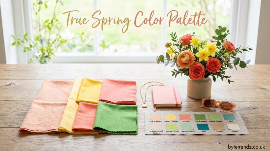
The heart of this palette includes shades like coral, peach, warm yellow, apricot, and grass green. These colors capture the essence of blooming flowers and new growth, and they tend to look most flattering when worn close to the face. Warm pinks and poppy red also belong here, adding a cheerful, energetic quality without veering into anything harsh or cool.
Greens play a particularly important role in this palette, ranging from fresh grass green to a clear, warm emerald. Turquoise and warm-leaning teal also appear, offering a nod to blue while staying firmly rooted in the warm undertone that defines the entire season. These blue-green shades are often the easiest way for someone to test whether True Spring suits them, since a true cold blue tends to look out of place.
Beyond the brighter accent shades, the palette rounds out with warm golds and orange-based reds. Together, these colors create a wardrobe that feels cohesive and intentional, since almost every shade shares the same golden thread running through it.
Neutral Shades That Complete the Palette
Neutrals matter just as much as the brighter accent colors, especially for building a wardrobe that works for everyday life. True Spring neutrals include ivory, camel, warm brown, and toffee, all of which carry that same golden undertone found throughout the rest of the palette. These shades are useful for basics like trousers, blazers, and bags, since they blend easily with the brighter colors without introducing any coolness that would clash.
Darker neutrals do exist within this palette, but they lean warm rather than stark. Warm brown-black, warm charcoal, and a clear navy can all work well, particularly for those who need something deeper for professional settings. The key is avoiding true black or a cool charcoal, since both can overwhelm the warmth of a True Spring complexion and create an unflattering contrast.
These neutrals are especially helpful for people transitioning into this palette from a wardrobe full of cooler basics. Swapping out black for warm brown or navy, and trading stark white for ivory, often makes an immediate visible difference in how the face looks against the fabric.
True Spring vs Other Spring Palettes
One of the most common points of confusion is telling True Spring apart from its neighboring palettes, Light Spring and Bright Spring. Light Spring tends to be softer and paler overall, with less saturation and a gentler quality that suits those with more delicate coloring. True Spring, by comparison, holds more depth and richness while still staying within the warm, clear spring family.
Bright Spring shares the vividness of True Spring but pulls in a touch of winter’s contrast, giving it a slightly cooler and more electric quality. Someone who is a Bright Spring might wear a true cold pink or a sharper blue, while a True Spring would choose the warmer coral or turquoise version of that same color. The difference can be subtle, which is why professional color draping or careful comparison is often needed to tell the two apart.
It also helps to compare True Spring against the warm autumn palette, since both share a golden undertone. Autumn colors are more muted and earthy, often described as having a toasted or spiced quality, while True Spring colors stay bright and clean. Holding an autumn rust next to a true spring coral makes the difference obvious, since one looks dusty and the other looks fresh.
How to Know If True Spring Is Your Season
Certain physical traits often point toward this palette, though no single feature guarantees it on its own. Golden blonde, strawberry blonde, or warm auburn hair is common among True Springs, along with skin that has a peachy or golden undertone rather than a pink or olive one. Eyes are often a clear blue, green, or hazel, without the smoky quality seen in some other seasons.
A simple way to test this at home is to hold different fabric swatches near your face in natural daylight and watch how your skin responds. True Spring colors should make your complexion look brighter and more even, while cooler or muted shades tend to create shadows or make the skin look sallow. Coral and warm turquoise are especially useful test colors, since they react strongly against skin that does not suit them.
While self-testing can offer useful clues, a professional color analysis remains the most reliable way to confirm your season. Trained colorists use draping techniques that compare dozens of fabrics against your skin, hair, and eyes in controlled lighting, which removes much of the guesswork involved in identifying your exact palette.
Building a Wardrobe Around True Spring Colors
Once you know your palette, building a wardrobe becomes far more intentional. Start with neutral basics like camel trousers, an ivory blouse, or a warm brown jacket, since these pieces form the foundation that everything else builds on. From there, add accent pieces in coral, warm green, or turquoise to bring in the brightness that defines this season.
Layering matters too, since combining a warm neutral with a vivid accent color often creates the most flattering look. A camel coat over a coral sweater, for example, lets the warmth of both pieces reinforce each other rather than compete. Patterns can work well within this palette too, as long as the colors used stay within the warm, clear family rather than introducing cool or muted tones that break the harmony.
Accessories offer an easy entry point for anyone hesitant to commit to bold clothing colors right away. A turquoise scarf, coral handbag, or gold-toned jewelry can introduce the palette gradually while still making a visible difference in how the outfit reads against the skin.
True Spring in Makeup and Beauty
Makeup follows the same warm, clear logic as clothing for this palette. Foundation shades should lean golden or peachy rather than pink or neutral, since a cool-toned base can wash out the natural glow that defines True Spring coloring. Blush in coral or warm pink tends to look far more natural than anything with a cool or mauve undertone.
Eye makeup benefits from warm bronzes, golden browns, and soft greens, all of which enhance rather than compete with typical True Spring eye colors. Lip colors do well in coral, warm red, or peachy pink, echoing the same tones found throughout the rest of the palette. Even something as simple as switching a lipstick from a blue-based red to an orange-based one can make a noticeable difference in how balanced the whole face looks.
Hair color choices matter as well, particularly for anyone considering highlights or a full color change. Golden blonde, warm copper, and rich auburn tend to work best, while ash tones or cool platinum shades can clash with the underlying warmth of the skin.
Common Mistakes to Avoid With This Palette
The most frequent mistake is reaching for muted or dusty colors, which belong more to the autumn or summer palettes than to True Spring. Sage green, dusty rose, and muted mauve might seem gentle and easy to wear, but they tend to flatten the natural brightness that makes True Spring coloring stand out. Sticking to clearer, more saturated versions of these colors usually gives a better result.
Another common misstep is choosing cool-toned blacks, grays, or blues as go-to basics. While these colors are versatile for many other seasons, they can create a harsh contrast against warm skin and hair, making the face look tired rather than radiant. Swapping black for warm brown or charcoal, and cool gray for a warmer taupe, solves this problem without sacrificing versatility.
Finally, some people assume that because spring is associated with pastels, True Spring must stick to only the palest shades. In reality, this palette allows for real depth and saturation, so avoiding color altogether or leaning too heavily on baby pastels can actually undersell how vibrant and rich this season can look.
Conclusion
The True Spring color palette offers a warm, bright, and refreshingly clear approach to color that mirrors the season it is named after. From coral and turquoise to warm greens and golden neutrals, every shade in this palette shares a common thread of sunlit warmth and natural clarity. Whether you are building a new wardrobe, updating your makeup routine, or simply trying to understand your own coloring better, learning to work with these colors rather than against them can make a real difference in how put together and radiant you look every day. Like any color analysis system, it works best as a flexible guide rather than a strict rulebook, so use it as a starting point to discover what genuinely makes you feel confident.
Frequently Asked Questions
What is the difference between True Spring and Warm Spring? True Spring and Warm Spring refer to the same seasonal color type. Different color analysis systems simply use different names for this warm, clear, and bright palette.
Can a True Spring wear black? Pure black tends to overwhelm the softness of True Spring coloring. A warm brown-black or warm charcoal usually works better as a dark neutral alternative.
Is True Spring the same as Bright Spring? No. Bright Spring carries a bit more winter-like contrast and coolness, while True Spring stays consistently warm across its entire palette, including its brightest accent colors.
What jewelry tone suits True Spring best? Gold and warm-toned metals generally complement True Spring coloring better than silver, since they echo the golden undertone found throughout the palette.
How can I find out my exact color season? While online guides and self-testing with fabric swatches can offer helpful clues, a professional color analysis with in-person or virtual draping remains the most accurate way to confirm whether True Spring is your best season.
