


Spring has always been associated with renewal, sunshine, and fresh growth, and nowhere is that more visible than in the world of seasonal color analysis. Among the four spring subtypes, True Spring stands out as the warmest and most vivid of them all. Also known as Warm Spring, this palette captures the exact moment when the season is in full bloom, bursting with golden light and clear, saturated hues. If you have ever wondered why certain colors make your skin glow while others leave you looking tired, understanding your color season can be the missing piece. True Spring Color Palette This guide walks through what True Spring really means, how to spot it in your own coloring, and how to use it confidently in your wardrobe, makeup, and even your home.
What Is the True Spring Color Palette?
True Spring sits at the heart of the spring family in the twelve season color analysis system, positioned between Bright Spring and Light Spring. It represents the season in its purest form, meaning every color in the palette leans warm, clear, and lively. There are no muted, dusty, or cool-toned shades here, since the entire palette is built around golden undertones and high visual energy.
Think of the freshness of new grass, the brightness of citrus fruit, and the glow of early sunshine, and you have a good sense of what this palette feels like. Unlike Autumn palettes, which share warmth but lean earthy and deep, True Spring colors stay light to medium in depth while remaining vibrant. This combination of warmth and clarity is what makes the palette feel so youthful and full of vitality.
Color analysis itself is not about limiting your choices but about learning which shades work with your natural coloring instead of against it. The goal is to let your skin, eyes, and hair look healthy and radiant, rather than letting an outfit overpower your features. For a True Spring, that means reaching for colors that mirror the warmth already present in your complexion.
Key Characteristics of a True Spring Complexion
People with a True Spring coloring typically have warm, golden undertones in their skin, which can range from fair to a light tan. The complexion often has a sun-kissed or peachy quality, and there is rarely any pink or blue cast to the skin. This warmth is the defining trait that separates True Spring from cooler seasons like Summer or Winter.
The eyes tend to be bright and clear rather than deep or smoky, often appearing in shades like green, hazel, light brown, or amber, sometimes with golden flecks. Hair color usually falls somewhere between golden blonde and warm auburn or light golden brown, with a natural shine that reflects light well. There is generally a medium contrast between hair, skin, and eyes, which is part of what gives True Spring its balanced and harmonious look.
It is worth remembering that these traits are general guidelines rather than strict rules. Not every True Spring will match every single characteristic, and that is completely normal. If your overall impression is warm, bright, and fresh rather than cool, deep, or muted, there is a strong chance this palette will suit you even if a few individual features differ slightly.
The Best Colors for True Spring
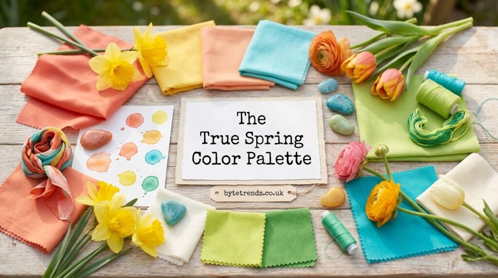
The True Spring palette is full of energetic, saturated shades that mimic the colors of blooming flowers and fresh foliage. Warm yellows, golden oranges, and coral pinks are signature choices, along with vivid greens that resemble new leaves in early spring. These colors work because they share the same golden warmth found in the skin, creating a seamless, flattering effect rather than a clash.
Even blue tones in this palette carry a warm twist, which is why turquoise and clear teal often appear instead of icy or navy blues. Bright, true reds and warm coral reds also belong here, offering a bold option for those who want a statement color without straying into cool or muted territory. The overall rule of thumb is that if a color looks like it has been dipped in golden sunlight, it likely belongs in this palette.
Because the palette favors clarity over softness, pastels used by a True Spring should still carry warmth and brightness rather than a chalky or gray undertone. A soft peach or warm buttery yellow will read far better than a cool lavender or icy pink. This attention to undertone is really the heart of what makes seasonal color analysis effective.
Neutrals That Complete the True Spring Wardrobe
Neutrals matter just as much as the standout colors, since they form the foundation of most wardrobes. For True Spring, ivory works better than stark white, as it keeps the same warm softness found throughout the rest of the palette. Camel, caramel, and warm golden browns also serve as reliable neutrals that pair effortlessly with brighter accent shades.
Dark neutrals can still be worn, but they should lean warm rather than cool. A warm charcoal or a rich brown-black will feel far more natural on a True Spring than a true black, which can appear harsh against warm, golden skin. Bright navy is another useful anchor color, offering the depth of a classic neutral while still carrying enough warmth to blend with the rest of the palette.
Building a small collection of these neutrals gives structure to a True Spring wardrobe, allowing the brighter shades like coral, turquoise, and golden yellow to shine as accents. This balance between grounded neutrals and lively accent colors is what makes the palette so wearable in everyday life, not just for special occasions.
How True Spring Differs from Other Spring Seasons
While all spring seasons share warmth as a common thread, they differ in brightness and depth. Light Spring leans softer and lighter, with more delicate, airy tones, while Bright Spring pushes saturation even further, sometimes borrowing a touch of coolness for extra vibrancy. True Spring sits right in the middle, balancing brightness and warmth without leaning too far in either direction.
This is also why True Spring is sometimes described as the most classic or original spring palette, since it represents warmth and clarity in their most balanced form. Someone who is a Bright Spring might find that certain True Spring colors look slightly too soft, while a Light Spring might find them a touch too intense. Recognizing these subtle differences helps avoid the common mistake of assuming all warm-toned people belong to the same palette.
Makeup Tips for True Spring
Makeup for a True Spring should echo the same warmth and brightness found in the clothing palette. Peach and coral blushes tend to look more natural than pink or mauve shades, since they match the undertone of the skin rather than fighting against it. Warm gold or bronze highlighters can enhance the natural glow that many True Springs already have.
For lips, coral, orange-red, and warm pink shades tend to work beautifully, while very cool berry or plum tones can look out of place. Eye makeup benefits from warm bronzes, soft golds, and touches of teal or green, which complement eye colors like hazel, green, and light brown. Keeping makeup warm rather than cool ties the whole look together in a way that feels effortless.
Styling True Spring in Everyday Fashion
Incorporating this palette into daily life does not require an entirely new wardrobe overnight. Starting with a few key pieces, such as a coral top, a golden yellow scarf, or a pair of turquoise earrings, can make a noticeable difference without a major investment. These small additions near the face tend to have the biggest visual impact, since they sit closest to the skin and eyes.
Layering warm neutrals like camel or ivory underneath brighter accent colors creates outfits that feel put together rather than overwhelming. For workwear, pairing a bright navy blazer with a coral or peach top offers a professional look that still honors the warmth of the palette. Over time, swapping out cooler-toned staples for their warm equivalents can transform an entire closet gradually and affordably.
Colors to Avoid if You’re a True Spring
Just as certain colors enhance a True Spring’s natural glow, others can work against it. Cool, icy shades such as pale blue, lavender, or stark white tend to wash out warm skin tones, making the complexion appear dull or tired. Muted, dusty colors can also flatten the natural brightness that defines this palette.
Very dark or heavy colors, like true black or deep burgundy, can overwhelm the lighter to medium depth typical of True Spring coloring. This does not mean these colors can never be worn, but they generally work better as small accents rather than dominant pieces close to the face. Paying attention to how a color makes the skin look in natural light is often the simplest way to tell if it belongs in the palette.
Bringing True Spring Into Your Home and Accessories
The principles of seasonal color analysis extend beyond clothing and makeup into home decor and accessories as well. Turquoise glassware, coral cushions, and warm camel throws can bring the same cheerful energy of the True Spring palette into a living space. These choices create rooms that feel bright and welcoming without becoming overwhelming.
Accessories like handbags, shoes, and jewelry also benefit from warm undertones, whether that means gold-toned jewelry over silver or a caramel leather bag instead of a cool gray one. Building a small reference collection of favorite swatches, whether physical fabric samples or saved photos, can make shopping decisions easier and more consistent over time.
How to Confirm If You’re a True Spring
While self-assessment using the characteristics above is a helpful starting point, many people find it useful to test actual fabric swatches against their skin in natural daylight. Holding a warm coral or golden yellow near the face and comparing it to a cool pink or icy blue often makes the difference obvious, since warm colors will brighten the complexion while cool ones dull it.
For a more precise result, working with a trained color analyst can help account for subtle variations that are hard to judge alone, especially for those with in-between coloring. Whether through professional analysis or careful home testing, the goal remains the same: finding the colors that let your natural warmth and brightness stand out.
Conclusion
The True Spring color palette celebrates warmth, clarity, and the fresh energy of the season at its peak. From golden yellows and corals to warm turquoise and camel neutrals, every shade in this palette is designed to work with, rather than against, naturally warm and bright coloring. Whether applied to clothing, makeup, or home decor, understanding this palette offers a practical way to look and feel more radiant using colors that already complement your natural features. Like all seasonal color guidance, it works best as a flexible tool rather than a rigid rulebook, allowing room for personal taste while still highlighting what makes your coloring unique.
Frequently Asked Questions
What is the main difference between True Spring and Bright Spring? True Spring balances warmth and brightness evenly, while Bright Spring pushes saturation further and can include a slight cool undertone for extra vibrancy.
Can a True Spring wear black? Pure black can look harsh against warm, golden skin, but warm charcoal or brown-black often works better as a substitute for darker pieces.
Is True Spring the same as Warm Spring? Yes, True Spring and Warm Spring refer to the same season within the color analysis system and are used interchangeably.
What jewelry tone suits True Spring best? Gold-toned jewelry generally complements True Spring coloring better than silver, since it matches the warm undertones in the skin.
Do I need a professional analysis to know my season? Not necessarily. Testing fabric swatches in natural light against your skin can offer strong clues, though a professional analyst can provide more precise confirmation.
